JP
Physio
Frisco, TX
JP Physio needed a logo and branding that would position them as a leading provider of patient-centered physical therapy for active adults and athletes.
Solution:
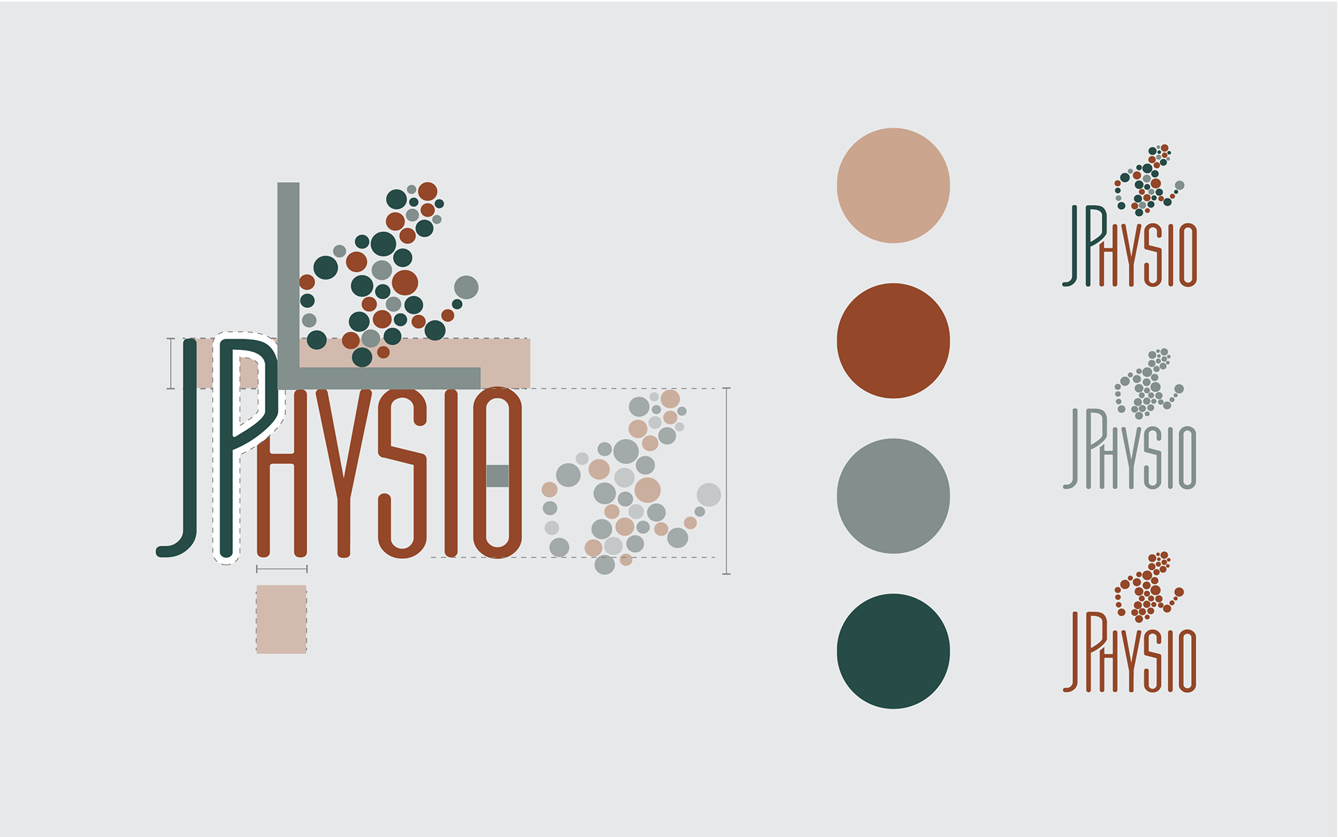
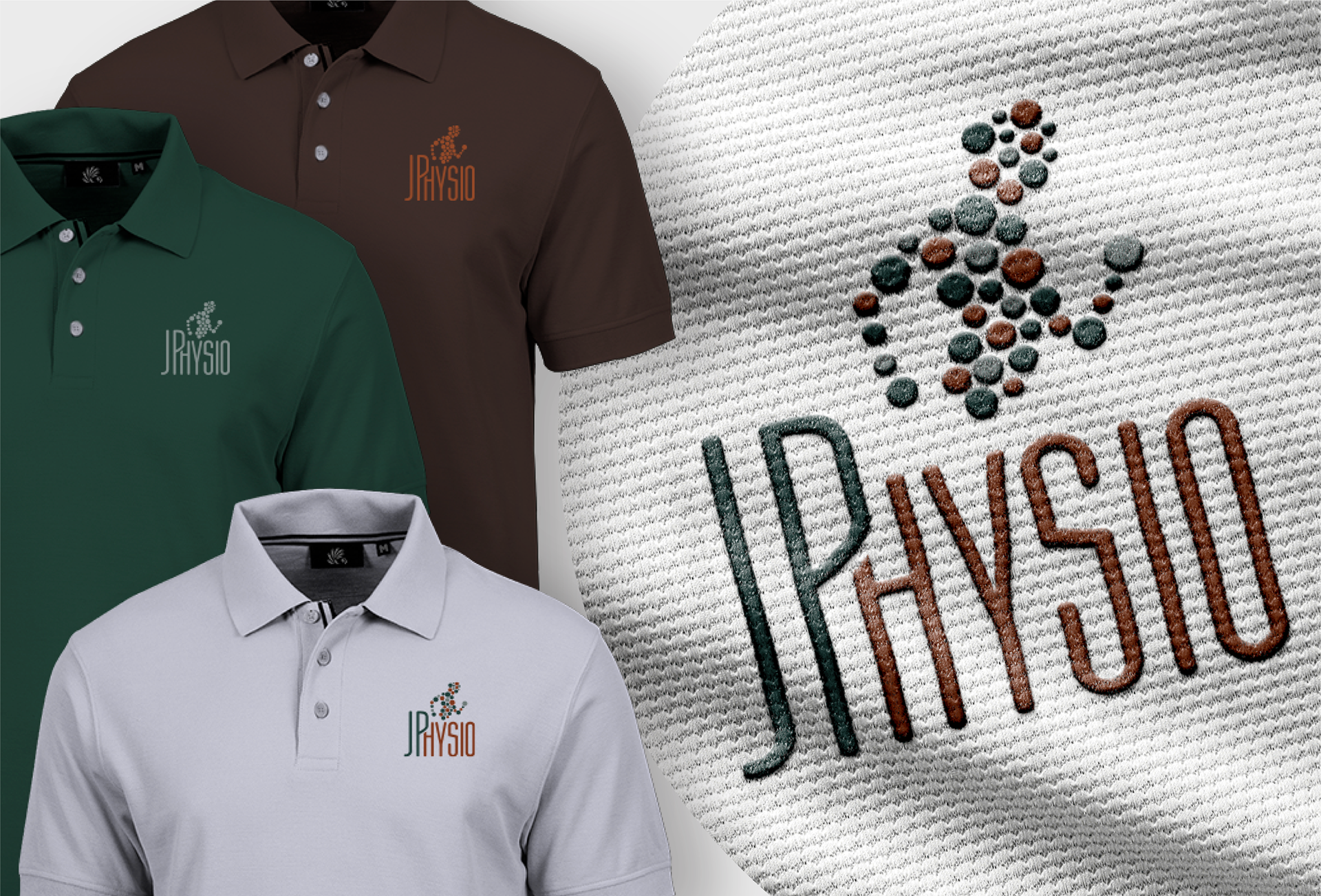
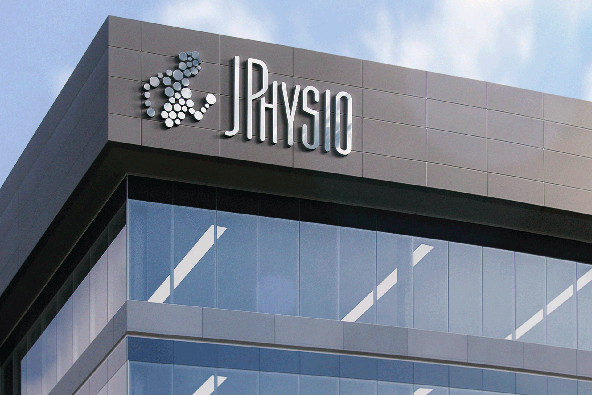
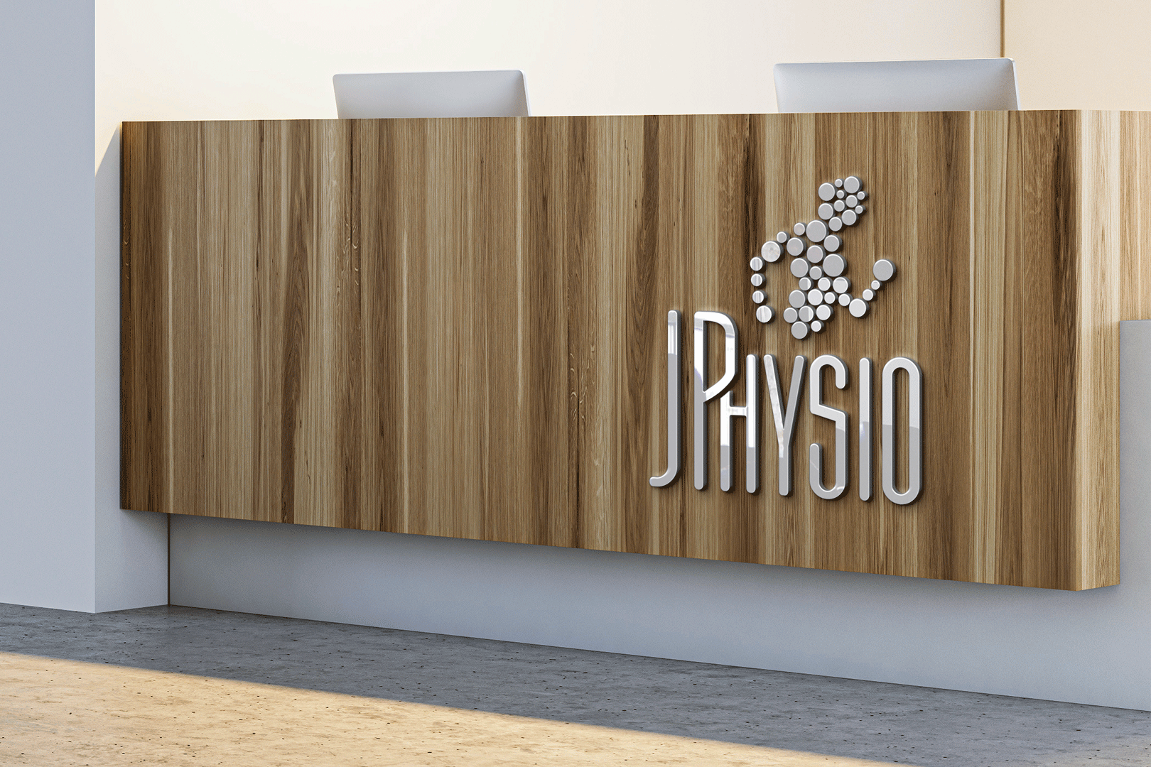
The logo was designed using circles arranged in the shape of a body in motion, which conveyed the idea of holistic care, a focus on each part of the body, and active recovery.
The deep color of green was the client's choice, and it conveys endurance and harmony. The complimentary color I chose was a darker shade of orange that signifies a feeling of rejuvenation.
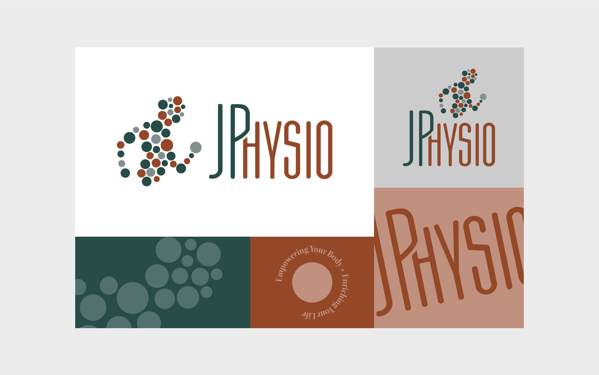

Logo Tone & Style:
Friendly, approachable, stable, and reassuring.
JP Physio wanted to convey a sense of expertise in personalized, whole-body care, as well as a representation of them being a reliable partner in their patient's journey to recovery. It was important they appear friendly and approachable to enhance JP Physio's commitment to building lasting relationships with patients.
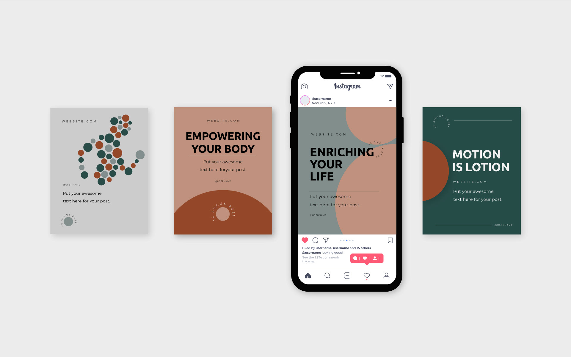
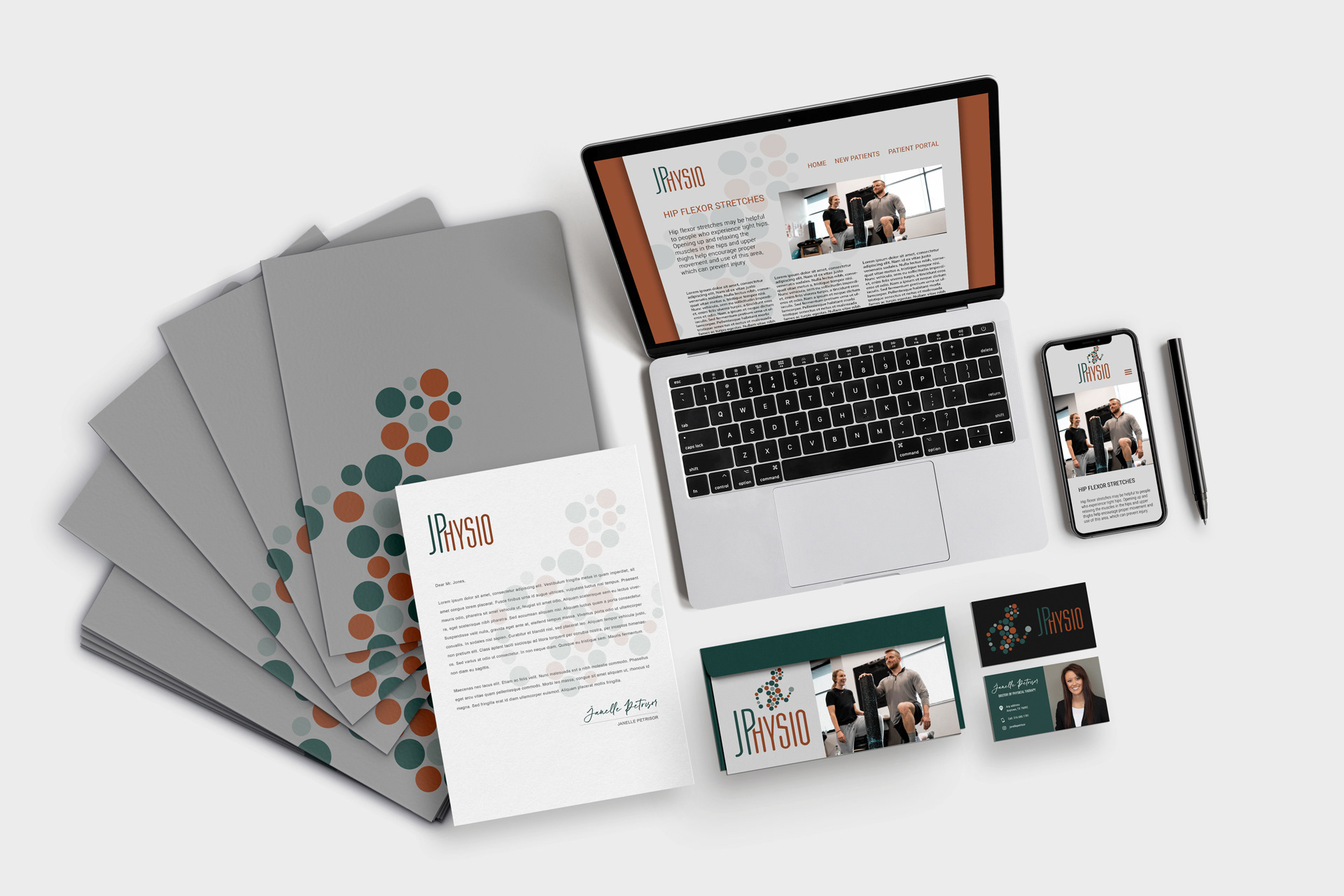
The design was implemented across all marketing and promotional materials, including a website UI, social media, staff uniforms, and designs for office and building signage.
Results:
The logo successfully captured JP Physio's philosophy and resonated with the target audience. The use of circles conveyed the idea of holistic care and the importance of treating the whole body rather than just the individual parts. Arranging the circles in the shape of a body in motion represented the active recovery of a healed person with a better quality of life.