Beautiful
Strength
Grapevine, TX
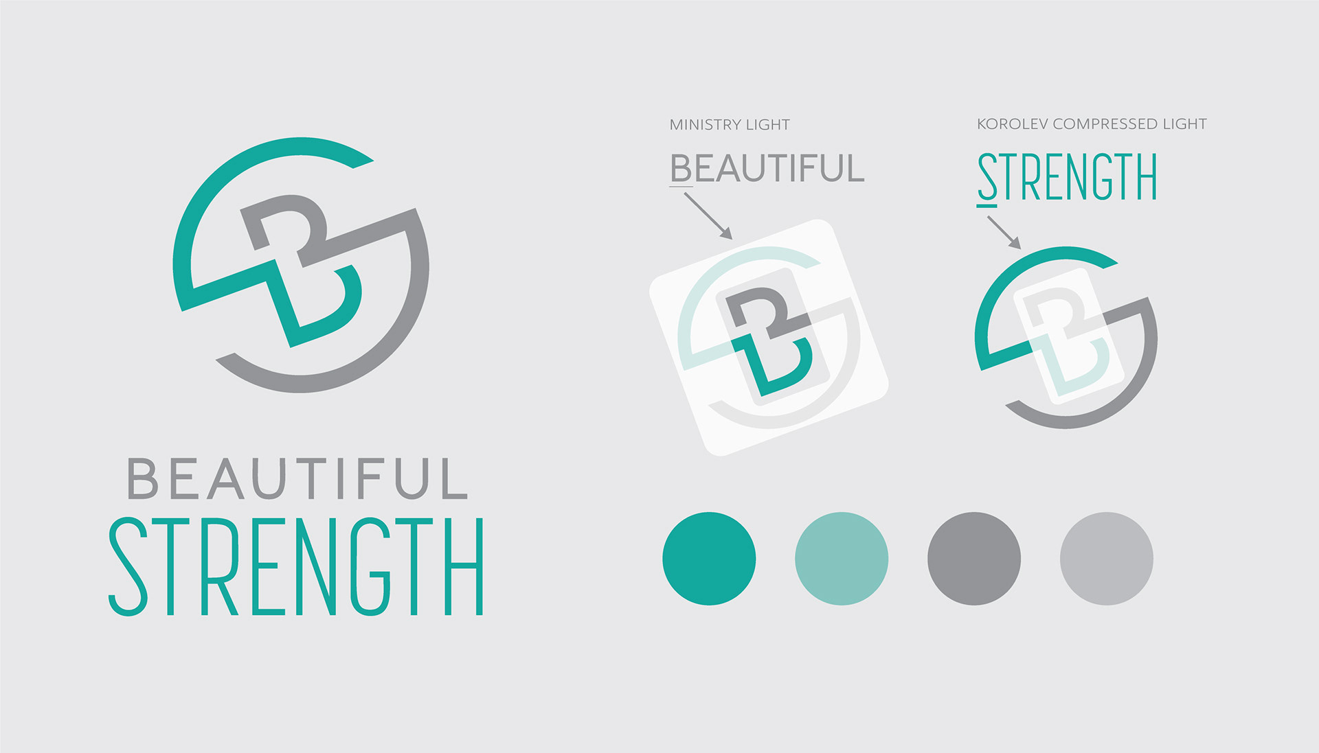
When Alexandra Schell, a certified kettle bell trainer and fitness model, opened her fitness studio she needed a logo and branding that represented her passion for fitness. While she preferred the name "Beautiful Strength," she aimed for a brand that could be universally relevant and age-inclusive without any gender bias.
Challenge:
The primary challenge was developing a logo and brand image that captured the idea that "being strong is beautiful," while avoiding gender stereotype that could be associated with word "beautiful."
Solution:
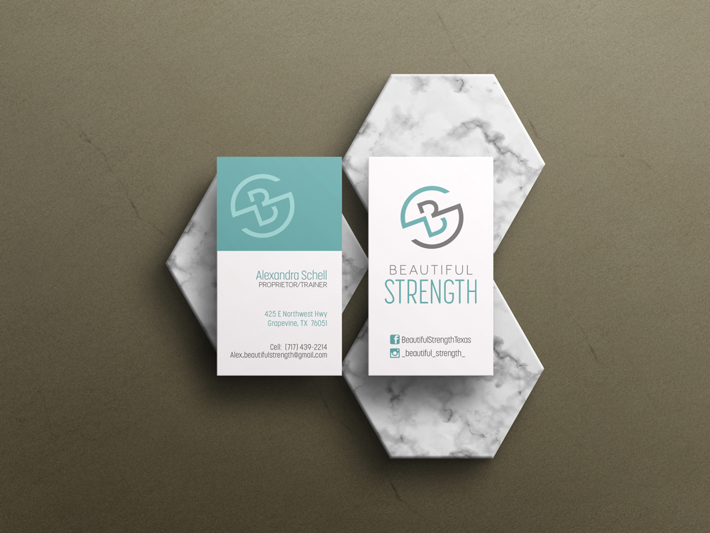
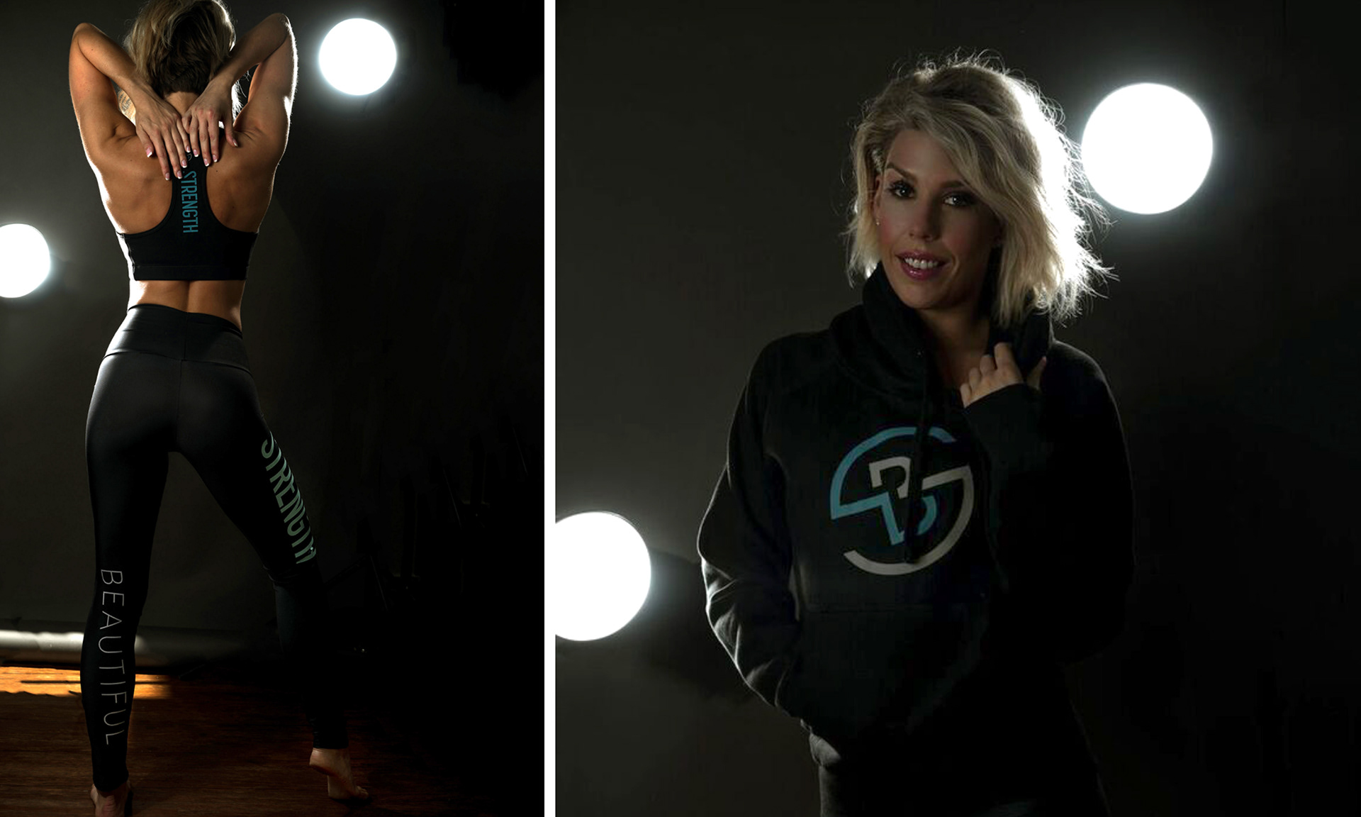
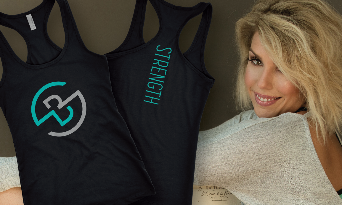
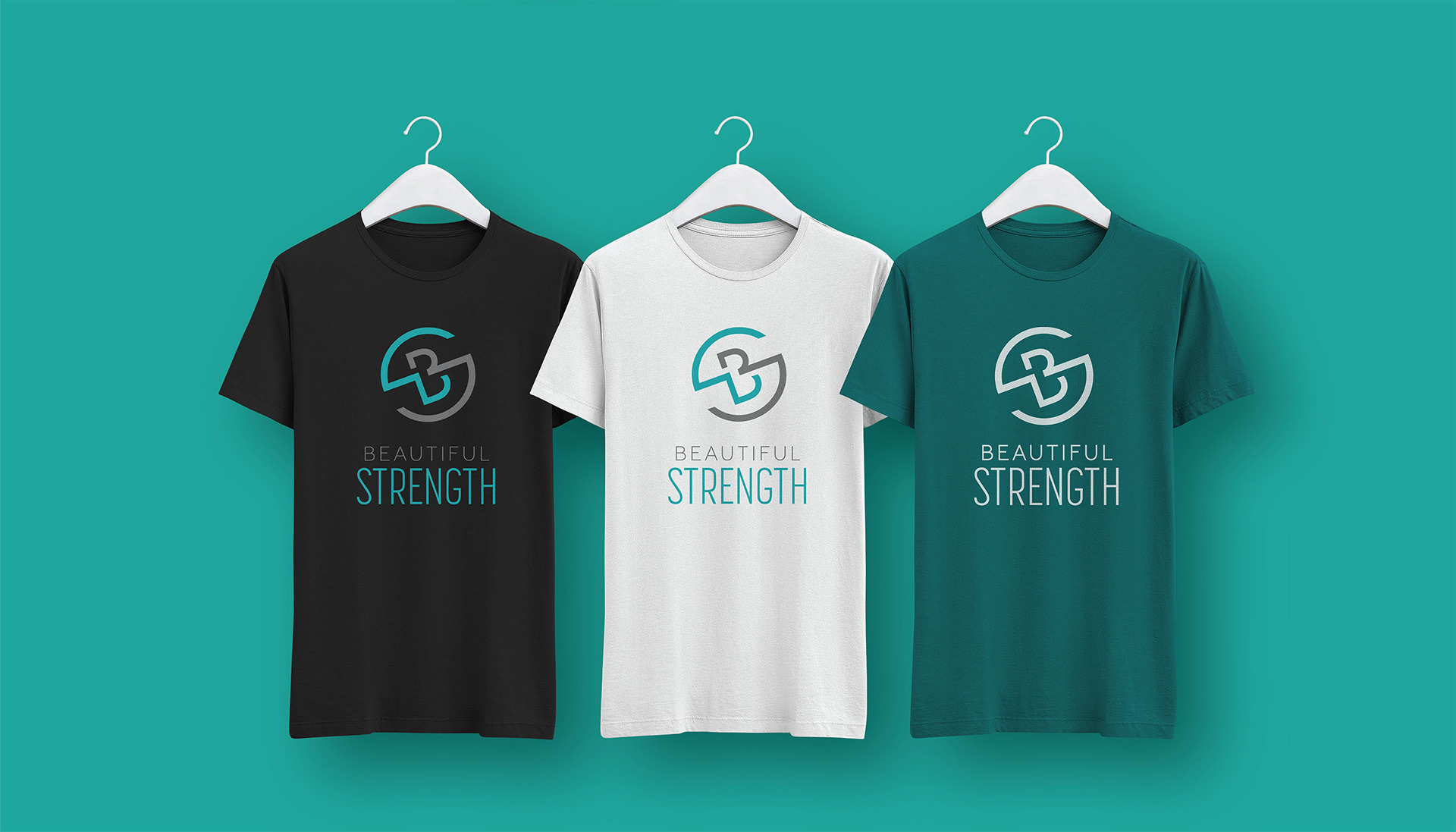
After conducting market research and gender neutral logo design studies, I developed a minimalist, monogram logomark that combined the B and the S in Beautiful Strength. The logotype features the words "Beautiful Strength" in capital letters with a clean, modern font. Overall, the combination mark was designed to be neutral and easily recognizable.
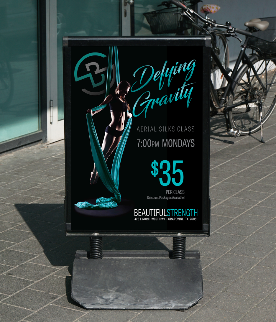
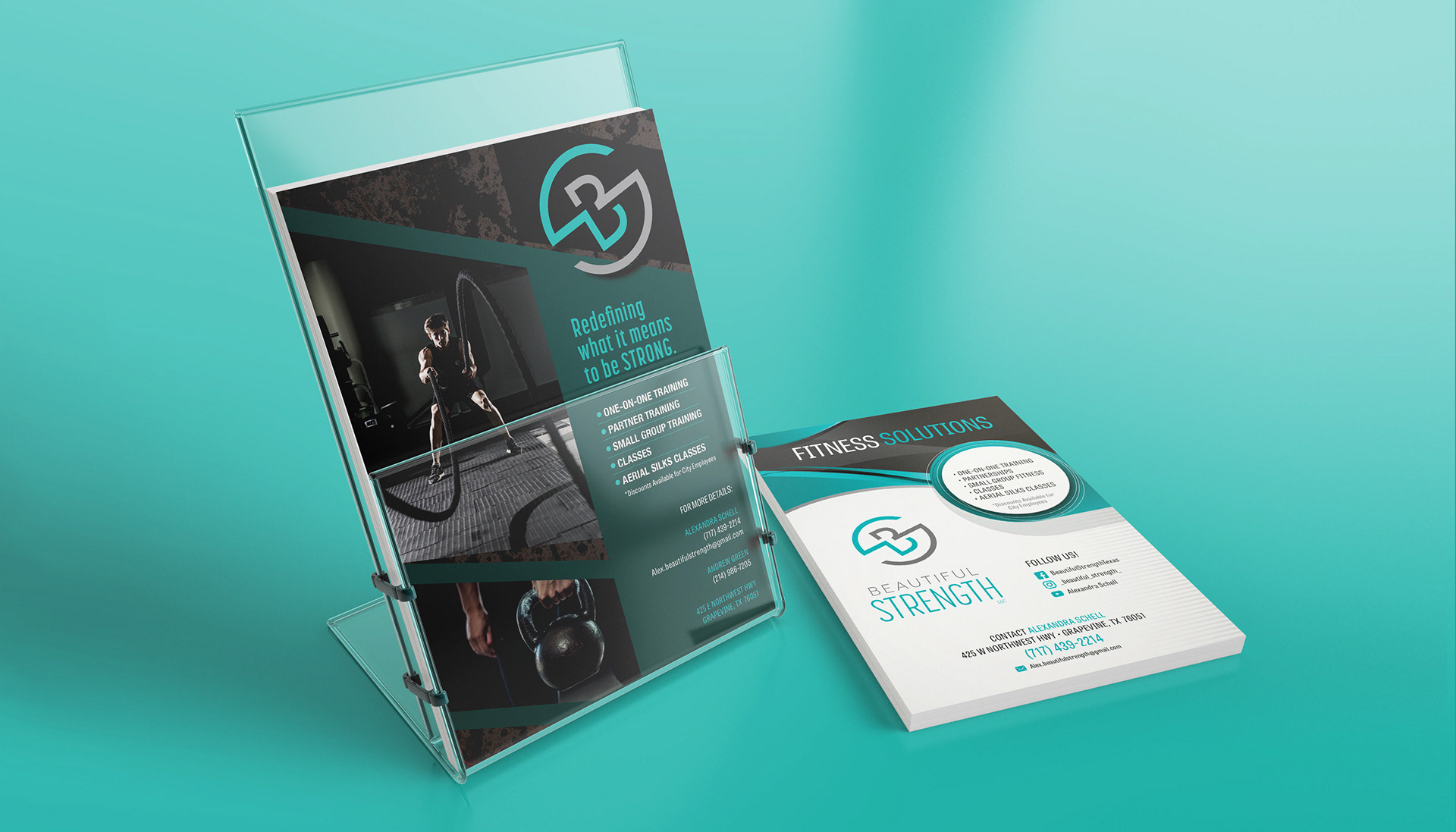
The color scheme included shades of teal and gray, evoking a sense of calm and strength.
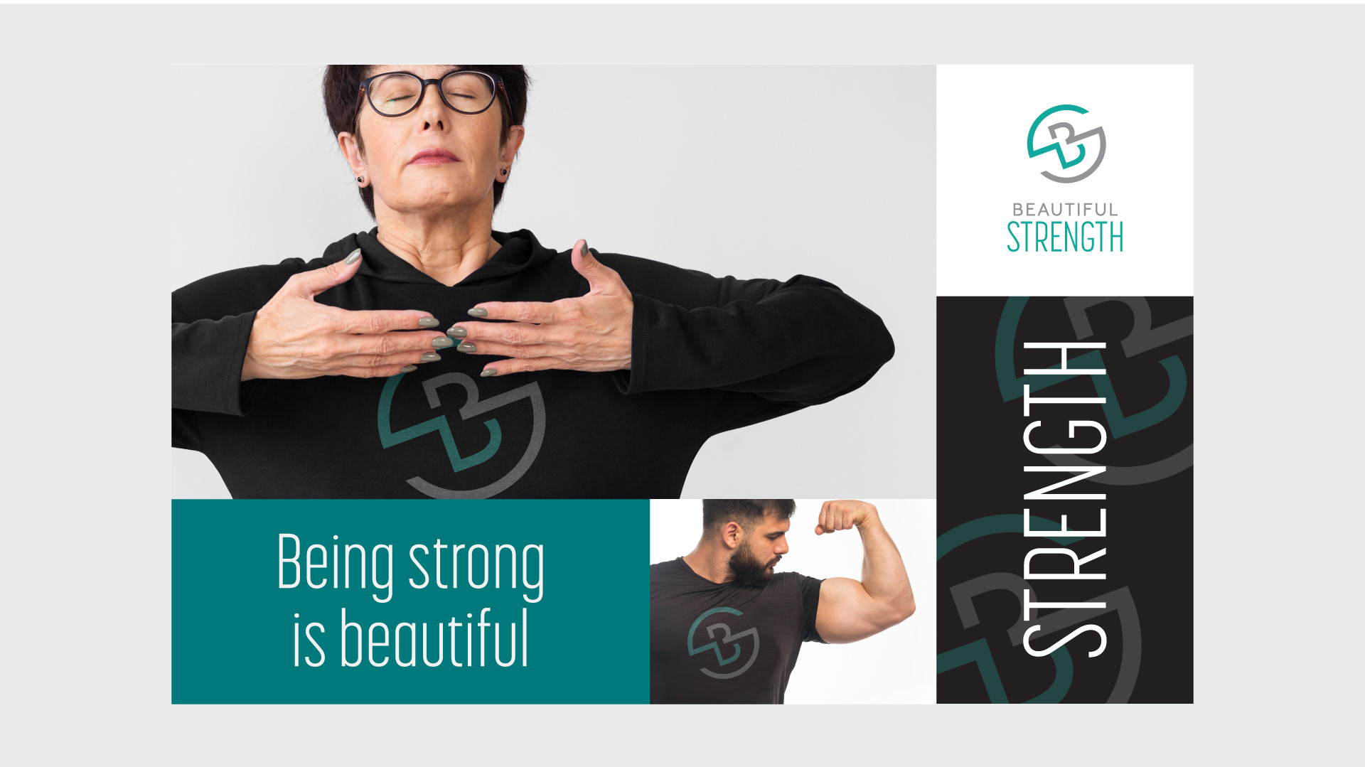
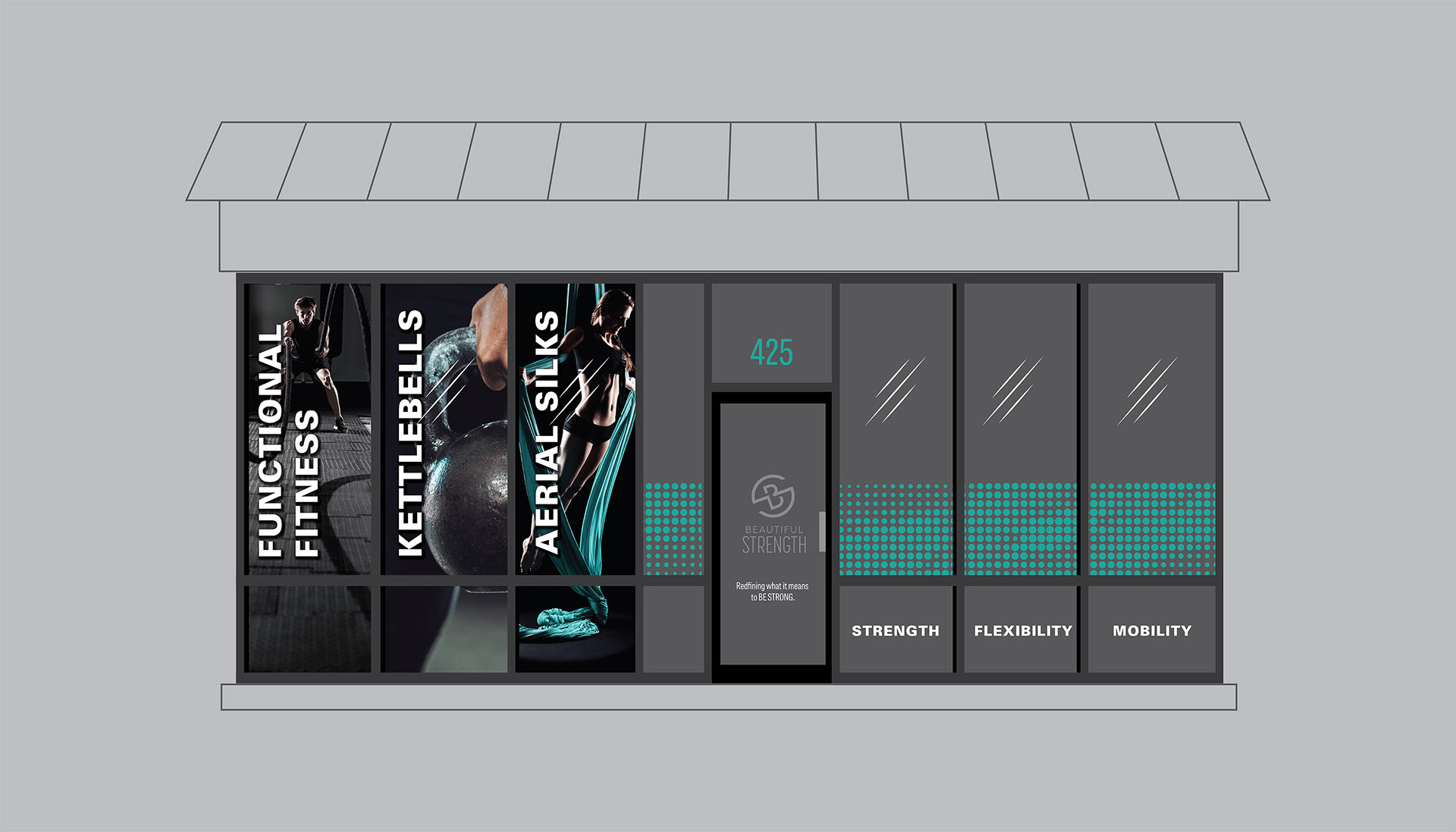
The logo and branding was used on promotional materials, business cards, flyers, posters, certificates, apparel, signage, and storefront graphics, as well as a mural for the studio walls.
I also created a simple video intro for use with social media using an online 3D Animation graphics generator.
Results:
The logo and branding helped to establish Beautiful Strength as a unique fitness studio that appeals to a broad audience. The logo has become a prominent feature of the studio's decor, creating a consistent and recognizable identity that is visible in all their social media posts. The marketing materials, including the branded apparel, have helped to build awareness and recognition of the Beautiful Strength brand in fitness events and trade shows, leading to a significant increase in public awareness, clientele and recruitment of staff trainers. Today, Beautiful Strength's fitness studio continues to grow and thrive, its brand playing a crucial role in its success.